
There are any number of reasons for the longevity of black and white images in this new age of digital photography. Artistically speaking, some moments lend themselves to monochrome more than they would in color. Commercial printing costs can be a factor. Sometimes even the weather can make a photoshoot go in a direction you did not intend. For me, it is a case of my early exposure to black and white film photography in the late 1970’s.
I find creating a good black and white image to be much more difficult than dealing with a color image. Color is natural and easy. Getting the proper tonal range for a black and white image can be daunting. There are plenty of pitfalls in converting to monochrome.

I have seen a lot of talented people simply drop the saturation on an image and be done with it. Others go a bit further and convert it by changing the mode to gray scale and calling it a day. Sure, that works, but it may not be the most optimal way of getting there.
When film was king, I used to carry around a number of color filters for various scenes. I had yellow, orange, red, blue and green filters of varying density for the effects I hoped to garner. More often than not, I used the yellow filter more than the others as yellow sat evenly in the middle of the color spectrum. This filter treated yellow as if it were white light and allowed it to pass unhindered. From that point on, other light frequencies were evenly attenuated allowing for a nice tonal range on the negative. Orange was similar, but with a bit more contrast. Red was my third go to filter for higher contrast on washed out hazy days; it was rare for me to use red but I remember doing just that.
The others were mostly dead weight in my bag and I never had need to use them.

The simple reason for that was the cost of time and effort. Developing negatives and printing images cost money and time. If the effect was not what I wanted, I was stuck with it. I knew how yellow and red were going to work and I went with what I knew. Time and money are finite and going outside of my comfort zone was a bit of a risk I wasn’t ready or able to afford.
Now that we are digital, life is a little less stressful when going monochrome.

There is a push in some quarters to duplicate the output of analog films with many third party plugins and presets in photo editing software. It’s really not my thing, but I understand the motivation of others who excel at creating amazing retro effects in their images. Retro presets are nice, but when looking for an original appearance, the first starting point is duplicating the effects of color filters.

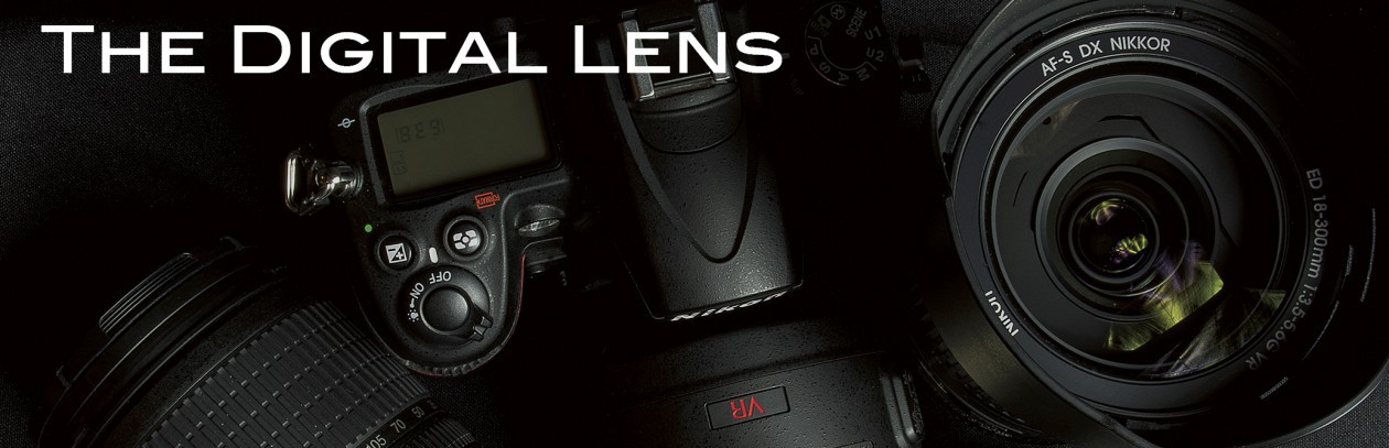
A yellow preset is a good place to start. Yellow exists at the very center of the visual spectrum and it allows colors to pass through at evenly spaced shades of gray. For a first go around, you can’t go too wrong to try this one and the result is an even, low contrast image. In most cases, this is my go to preset. Complementary colors, red and blue turn to dark tones and sometimes might be near impossible to differentiate without manually boosting one or the other as you see fit. The top title photo was converted using a yellow filter preset.

Orange is next. If yellow seems too washed out, step up to orange. Orange gives a higher contrast monochrome image and works well in hazy images. It is also very good for portraits and skin tones, balancing out blemishes and variations in skin color. Freckles and blotches fade using an orange filter.

Red is high contrast, but I have to stop right there. I don’t agree with how the presets for red filters are implemented in Adobe Lightroom. Red should pass through as if it were white light, while blue, the complementary color in the spectrum, should appear very dark. Blue skies should turn to a dark grey, making cloud appear dramatic, but that doesn’t seem to be the case for Adobe’s Lightroom presets. You might find yourself manually darkening blue in the development module of Lightroom to get the proper effect. In Photoshop CC, the high contrast red preset under the black and white adjustment menu looks much more like what I remember.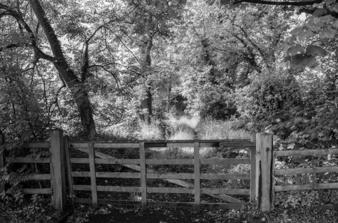
Green is a good filter to use when photographing forested and lush green scenes. There are three types of green in nature, Yellow-green (light green), green-green (green) and blue-green (dark green). Using a green filter will differentiate these shades nicely and give a low contrast to green landscapes.
Blue…I’m a big fan of beautiful blue skies and clouds and never could see the purpose of using a blue filter. A blue filter would just wash them out and I’m not up for that.
Other steps for retro effects include adding noise or grain. I took a photo of a very retro scene and after converting it to monochrome, it was way too clean and I ended up adding noise to rough it up. Other ways include using textures and adding scratches and rough borders. I’ve done this in video using Final Cut Pro X and it was a lot of fun.

When I go retro, I find that I have an image in my mind and I work to achieve that image with little compromise. Sometimes I don’t get what I want and I put it away for later. Other times, I exceed my expectations with something remarkable. Every time I go this route, I learn something new and applicable to even color photography. Not all retro is monochrome, colors also can be aged to appear from long ago.
But that is another story.
Happy Hunting Friends.
